

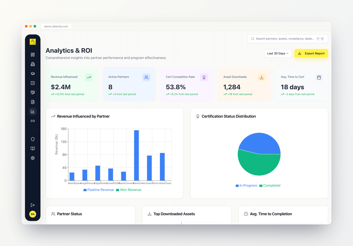
The Analytics & ROI dashboard with the five key metric cards across the top and the charts grid below
The time range selector
At the top right of the page is a time range dropdown. It offers four choices:Last 7 Days
A short, recent window for spotting fresh movement.
Last 30 Days
The default view when you open the page.
Last 90 Days
A quarter-length view for trend spotting.
Last Year
A full-year window for the widest picture.
The five key metrics
Across the top of the page sit five metric cards. Each shows one headline number with a small change indicator underneath comparing it to the previous period.Revenue Influenced
The total value of all deals marked Closed Won, shown in dollars. This is the money your partner ecosystem has helped bring in.
Active Partners
The number of partners whose integration status is Connected. It tells you how much of your ecosystem is live and syncing rather than pending or disconnected.
Cert Completion Rate
The share of all certifications with a status of Completed, shown as a percentage. A quick read on how far along your enablement program is.
Asset Downloads
The combined download count across every marketing asset. It shows how much your enablement and marketing content is being used.
The charts
Below the metric cards is a grid of six charts. Here is what each one shows and what you can learn from it.Revenue Influenced by Partner
This is a grouped bar chart with one pair of bars for each partner that has revenue. The blue bar is Pipeline Revenue (the total value of all deals tied to that partner) and the green bar is Won Revenue (the value of that partner’s Closed Won deals). Values are shown in thousands of dollars on the vertical axis, and the chart shows up to the first eight partners with revenue. Hover any bar to see a tooltip with the partner name, its pipeline figure, and its won figure. Use this chart to see who is filling your pipeline versus who is actually closing, and to spot partners with a big gap between the two.Certification Status Distribution
This is a pie chart that groups every certification by status. Each slice is color-coded:Completed
Green. Certifications that are fully earned.
In Progress
Blue. Certifications currently underway.
Not Started
Grey. Certifications assigned but not yet begun.
Expired
Red. Certifications that have lapsed.
Partner Status
This smaller pie chart groups your partners by integration status: Connected (green), Pending (amber), Disconnected (red), and Error (dark red). It is the visual companion to the Active Partners metric card. Hover a slice for the count, and read it to understand how healthy your integrations are and how many partners still need connecting or attention.Top Downloaded Assets
This is a horizontal bar chart listing your five most-downloaded marketing assets, longest bar at the highest count. Each bar is labelled with the asset title (long titles are trimmed) and its length reflects the download count. Hover a bar for the exact number. Use it to see which content partners actually reach for, so you know what to promote and what to create more of.Avg. Time to Completion
This line chart plots the average number of days to complete a certification, month by month, for the most recent six months that have completions. The vertical axis is labelled Days and each point is that month’s average. A downward line means partners are completing certifications faster over time, while an upward line signals enablement is slowing down.Partner Performance Overview
This is a ranked table, not a graph, and it spans the full width at the bottom of the page. It lists your top eight partners by an overall performance score, numbered from one. For each partner you see:Partner
The partner name with its internal owner underneath.
Tier
A colored tier badge (Bronze, Silver, Gold, or Platinum).
Revenue
That partner’s total deal revenue, shown in thousands.
Deals Won
How many of that partner’s deals reached Closed Won.
Completed Certs
How many certifications that partner has completed.
Performance Score
A blended score shown as a progress bar, combining won deals, completed certifications, and revenue.
Exporting a report
Next to the time range selector is the Export Report button. Select it to download a CSV file summarizing everything on the page.1
Set your time range
Choose the window you want the report labelled with from the time range dropdown.
2
Select Export Report
Select the Export Report button at the top right.
3
Open the file
A CSV file downloads automatically, named with the time range and the date. Open it in your spreadsheet tool.
The export is a plain CSV, so it opens in any spreadsheet application and is easy to share or paste into a slide.
Loading your data
Analytics loads automatically when you open the page. While it works, the metric cards and charts show placeholder shapes. Once your data arrives, the real numbers and charts fill in. If a chart looks empty, it usually means there is no matching data yet for that measure (for example, no completed certifications to average, or no partners with revenue).Who can do what
Analytics is a read-only, insight-only page. Nobody creates, edits, or deletes records here regardless of role.
- Admin: can view every chart and metric and export the report.
- Manager: can view every chart and metric and export the report.
- Viewer: can view every chart and metric and export the report.