> ## Documentation Index
> Fetch the complete documentation index at: https://docs.altamiq.com/llms.txt
> Use this file to discover all available pages before exploring further.
# Knowledge Base
> Browse, search, and manage AltamIQ's article library of internal documentation and partner resources, and create or edit articles organized by category, partner, and tags.
The Knowledge Base is your team's shared article library for internal documentation and partner resources. It's where you keep onboarding guides, sales playbooks, technical docs, FAQs, meeting and QBR notes, and troubleshooting write-ups, all organized so anyone on your team can find them quickly. Because every article lives in one place and can be tagged, categorized, and tied to a partner, you spend less time hunting for information and more time using it.
To open it, go to **Knowledge Base** in the sidebar. You'll land on a library of every article in your workspace, sorted with the most recently created at the top.
 ## What's on the library page
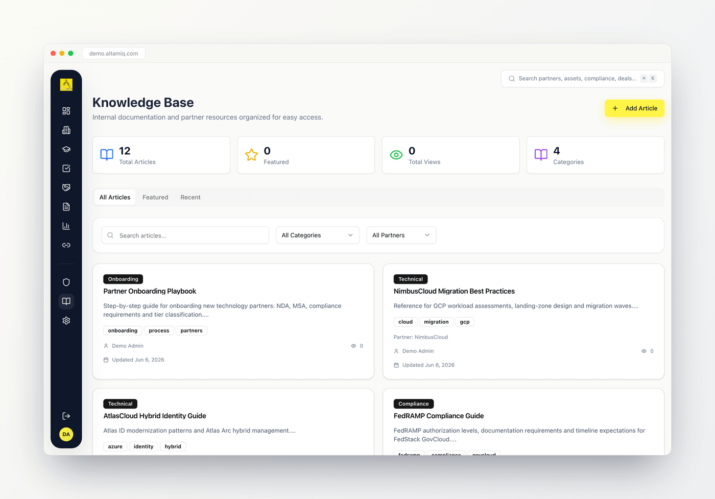
At the top of the page you'll see four quick stats that give you a snapshot of your library at a glance.
The total number of articles in your workspace.
How many articles have been marked as featured.
The combined view count across every article, so you can see how much your library is being used.
How many distinct categories are currently in use across your articles.
Below the stats, three tabs let you switch how the library is shown.
Every article in your workspace, shown as a grid of cards.
Only the articles marked as featured, shown as larger cards with a longer preview.
The ten most recently created articles, newest first.
Each article card shows the category as a colored badge, a star if the article is featured, the title, a short preview of the content, up to three tags, the linked partner if there is one, the author, the view count, and the date it was last updated.
## Reading an article
To open an article, click anywhere on its card. The article opens in a reader view with everything laid out for easy reading.
## What's on the library page
At the top of the page you'll see four quick stats that give you a snapshot of your library at a glance.
The total number of articles in your workspace.
How many articles have been marked as featured.
The combined view count across every article, so you can see how much your library is being used.
How many distinct categories are currently in use across your articles.
Below the stats, three tabs let you switch how the library is shown.
Every article in your workspace, shown as a grid of cards.
Only the articles marked as featured, shown as larger cards with a longer preview.
The ten most recently created articles, newest first.
Each article card shows the category as a colored badge, a star if the article is featured, the title, a short preview of the content, up to three tags, the linked partner if there is one, the author, the view count, and the date it was last updated.
## Reading an article
To open an article, click anywhere on its card. The article opens in a reader view with everything laid out for easy reading.
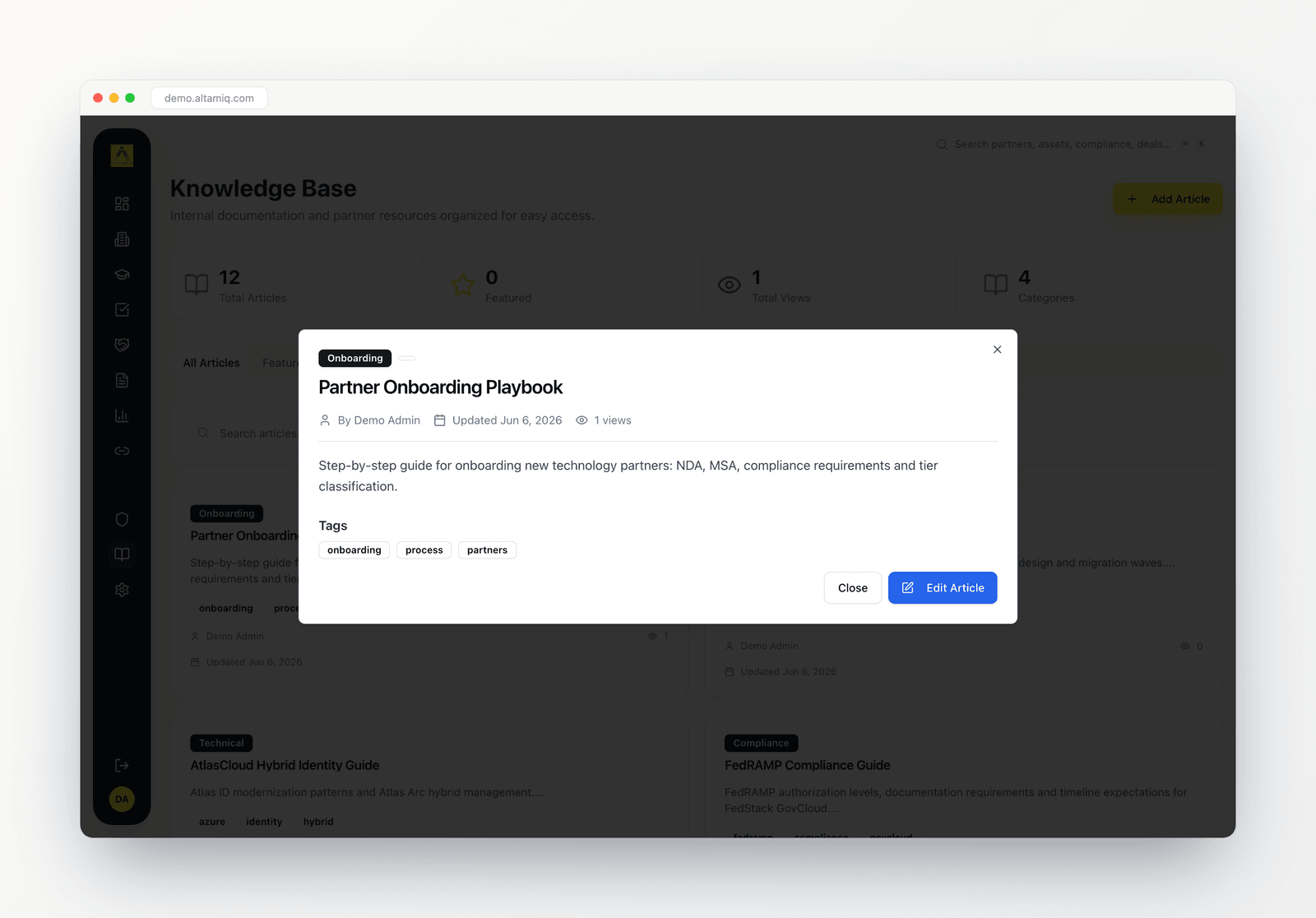 At the top you'll see the category badge, a Featured badge if it applies, and the visibility badge, followed by the title. Just below that is the article's metadata: who wrote it, when it was last updated, and how many times it's been viewed, plus the linked partner if one is set. The full article body appears next, followed by any tags and a link to open the attached document if the article has one.
Opening an article adds one to its view count, so the Total Views stat and each article's view number reflect real usage over time.
When you're done reading, click **Close**. If you have permission to edit, you'll also see an **Edit Article** button that opens the same article in the editing form.
## The categories
Every article belongs to one category, shown as a colored badge on the card and in the reader. Choosing the right category keeps your library tidy and makes filtering fast.
Guides and checklists for bringing a new partner up to speed.
Sales strategies, talk tracks, and playbook material.
Product and integration docs, setup steps, and technical references.
Answers to common questions from partners or your team.
Recommended ways of working and lessons learned.
Notes and takeaways captured from meetings.
Notes from quarterly business reviews.
Fixes and workarounds for known issues.
Anything that doesn't fit another category. This is the default for a new article.
## Finding articles with search and filters
The filter bar sits above the article grid and helps you narrow a long library down to exactly what you need. Search and both filters work together, so you can combine them.
Type in the **Search articles** box to match on the article title, the article content, or any of its tags.
Choose a single category, such as Sales Playbook or Troubleshooting, to show only articles in that group.
Show only articles linked to a chosen partner. The list is built from the partners already in your workspace.
To see the full library again, set the category and partner filters back to their "All" options and clear the search box.
## Featured articles
Marking an article as featured highlights your most important content so it's easy to find. Featured articles show a star on their card, appear together under the **Featured** tab, and count toward the Featured stat at the top of the page.
There are a few ways to feature an article:
* When creating or editing an article, tick the **Mark as Featured Article** checkbox.
* On any article card, open the actions menu (the three-dot icon) and choose **Mark Featured**, or **Remove Featured** to unfeature it.
* On the **Featured** tab, hover over an article and click **Remove Featured** to take it off the list.
## Creating an article
If your role allows it, you'll see an **Add Article** button in the top-right corner of the page. Creating an article opens a form where you fill in the details and write the content.
On the Knowledge Base page, click **Add Article** in the top-right corner. A dialog titled "Add New Article" opens.
Type a clear **Title**. This is how the article shows up in the library, in the reader, and in search.
Pick a **Category** to group the article. It starts at General, and you can change it to any of the categories described above.
Use the **Associated Partner** dropdown to connect the article to a partner, or leave it on **No Partner**. The list is built from the partners in your workspace, and once linked the partner's name appears on the card and in the reader.
Enter your name in **Author** so readers know who wrote the article.
Choose a **Visibility** level of Public, Internal, or Restricted. This is shown as a badge on the article and signals who the article is intended for. It defaults to Internal.
Use the large **Content** area to write the article. It's a spacious writing space that keeps your line breaks and spacing, so you can lay out paragraphs, lists, and sections and they'll read back the same way in the article view.
Pick a tag from the **Tags** dropdown and click **Add** to attach it. You can add several from the available options such as FAQ, Onboarding, Sales, Technical, Best Practice, Troubleshooting, Meeting, Strategy, and Training. To remove a tag, click the small x on its badge. Tags help teammates find the article through search.
Under **Attachments**, click **Choose File** to pick a document, then click **Upload**. Supported file types are PDF, DOC, DOCX, TXT, and MD. Once uploaded, readers can open it from the article with the Open Document link.
Tick **Mark as Featured Article** to highlight the article across the library.
Click **Create Article**. Your new article appears in the library right away.
Title, Category, Author, and Content are the core fields for a useful article. The associated partner, tags, and document attachment are optional and can be added whenever you like.
## Editing an article
You can update an article at any time if your role allows it. Open the actions menu (the three-dot icon) on an article card and choose **Edit**, or open the article in the reader and click **Edit Article**. The same form opens with all the current details filled in, so you can change the title, category, partner, author, visibility, content, tags, attachment, or featured status, then click **Update Article** to save your changes.
## Deleting an article
To delete an article, open the actions menu (the three-dot icon) on its card and choose **Delete**. You'll be asked to confirm before the article is removed, so an accidental click won't lose your content. Deleting is permanent, and it's an Admin-only action.
## Who can do what
What you can do in the Knowledge Base depends on your role.
Admins have full control. They can browse and read every article, create new articles, edit any article, mark articles as featured, and delete articles. Deleting is an Admin-only action.
Managers can browse and read every article, create new articles, edit any article, and mark articles as featured. They cannot delete articles, so the Delete option won't appear in the actions menu for them.
Viewers have read-only access. They can browse, search, filter, and read every article, but they can't create, edit, or delete. The Add Article button and the edit and delete actions won't be available.
If you expected to see the **Add Article** button or an **Edit** or **Delete** option and it isn't there, it's because your current role doesn't include that permission. Ask an Admin on your team if you need more access.
This documentation is built and hosted on [Mintlify](https://mintlify.com), a developer documentation platform.
At the top you'll see the category badge, a Featured badge if it applies, and the visibility badge, followed by the title. Just below that is the article's metadata: who wrote it, when it was last updated, and how many times it's been viewed, plus the linked partner if one is set. The full article body appears next, followed by any tags and a link to open the attached document if the article has one.
Opening an article adds one to its view count, so the Total Views stat and each article's view number reflect real usage over time.
When you're done reading, click **Close**. If you have permission to edit, you'll also see an **Edit Article** button that opens the same article in the editing form.
## The categories
Every article belongs to one category, shown as a colored badge on the card and in the reader. Choosing the right category keeps your library tidy and makes filtering fast.
Guides and checklists for bringing a new partner up to speed.
Sales strategies, talk tracks, and playbook material.
Product and integration docs, setup steps, and technical references.
Answers to common questions from partners or your team.
Recommended ways of working and lessons learned.
Notes and takeaways captured from meetings.
Notes from quarterly business reviews.
Fixes and workarounds for known issues.
Anything that doesn't fit another category. This is the default for a new article.
## Finding articles with search and filters
The filter bar sits above the article grid and helps you narrow a long library down to exactly what you need. Search and both filters work together, so you can combine them.
Type in the **Search articles** box to match on the article title, the article content, or any of its tags.
Choose a single category, such as Sales Playbook or Troubleshooting, to show only articles in that group.
Show only articles linked to a chosen partner. The list is built from the partners already in your workspace.
To see the full library again, set the category and partner filters back to their "All" options and clear the search box.
## Featured articles
Marking an article as featured highlights your most important content so it's easy to find. Featured articles show a star on their card, appear together under the **Featured** tab, and count toward the Featured stat at the top of the page.
There are a few ways to feature an article:
* When creating or editing an article, tick the **Mark as Featured Article** checkbox.
* On any article card, open the actions menu (the three-dot icon) and choose **Mark Featured**, or **Remove Featured** to unfeature it.
* On the **Featured** tab, hover over an article and click **Remove Featured** to take it off the list.
## Creating an article
If your role allows it, you'll see an **Add Article** button in the top-right corner of the page. Creating an article opens a form where you fill in the details and write the content.
On the Knowledge Base page, click **Add Article** in the top-right corner. A dialog titled "Add New Article" opens.
Type a clear **Title**. This is how the article shows up in the library, in the reader, and in search.
Pick a **Category** to group the article. It starts at General, and you can change it to any of the categories described above.
Use the **Associated Partner** dropdown to connect the article to a partner, or leave it on **No Partner**. The list is built from the partners in your workspace, and once linked the partner's name appears on the card and in the reader.
Enter your name in **Author** so readers know who wrote the article.
Choose a **Visibility** level of Public, Internal, or Restricted. This is shown as a badge on the article and signals who the article is intended for. It defaults to Internal.
Use the large **Content** area to write the article. It's a spacious writing space that keeps your line breaks and spacing, so you can lay out paragraphs, lists, and sections and they'll read back the same way in the article view.
Pick a tag from the **Tags** dropdown and click **Add** to attach it. You can add several from the available options such as FAQ, Onboarding, Sales, Technical, Best Practice, Troubleshooting, Meeting, Strategy, and Training. To remove a tag, click the small x on its badge. Tags help teammates find the article through search.
Under **Attachments**, click **Choose File** to pick a document, then click **Upload**. Supported file types are PDF, DOC, DOCX, TXT, and MD. Once uploaded, readers can open it from the article with the Open Document link.
Tick **Mark as Featured Article** to highlight the article across the library.
Click **Create Article**. Your new article appears in the library right away.
Title, Category, Author, and Content are the core fields for a useful article. The associated partner, tags, and document attachment are optional and can be added whenever you like.
## Editing an article
You can update an article at any time if your role allows it. Open the actions menu (the three-dot icon) on an article card and choose **Edit**, or open the article in the reader and click **Edit Article**. The same form opens with all the current details filled in, so you can change the title, category, partner, author, visibility, content, tags, attachment, or featured status, then click **Update Article** to save your changes.
## Deleting an article
To delete an article, open the actions menu (the three-dot icon) on its card and choose **Delete**. You'll be asked to confirm before the article is removed, so an accidental click won't lose your content. Deleting is permanent, and it's an Admin-only action.
## Who can do what
What you can do in the Knowledge Base depends on your role.
Admins have full control. They can browse and read every article, create new articles, edit any article, mark articles as featured, and delete articles. Deleting is an Admin-only action.
Managers can browse and read every article, create new articles, edit any article, and mark articles as featured. They cannot delete articles, so the Delete option won't appear in the actions menu for them.
Viewers have read-only access. They can browse, search, filter, and read every article, but they can't create, edit, or delete. The Add Article button and the edit and delete actions won't be available.
If you expected to see the **Add Article** button or an **Edit** or **Delete** option and it isn't there, it's because your current role doesn't include that permission. Ask an Admin on your team if you need more access.
This documentation is built and hosted on [Mintlify](https://mintlify.com), a developer documentation platform.